
Case study · Kakitangan.com
One design system for every Kakitangan screen
Kakitangan.com's modules were built at different times, so colours and buttons didn't always mean the same thing from page to page. I shaped the Kakitangan Design System, with principles, tokens, components and writing rules, then brought it into the engineers' shared components so every new page gets it for free.
- My role
- UI/UX Designer + PM
- Year
- 2025 – 2026
- Covers
- Foundations, components, writing
- Tools
- Storybook, Tailwind
40
components documented in Storybook, with 228 live examples
42
changes I made to the shared components and their docs
4.5:1
minimum text contrast, on every surface, in light and dark
Principles
Every colour has one job
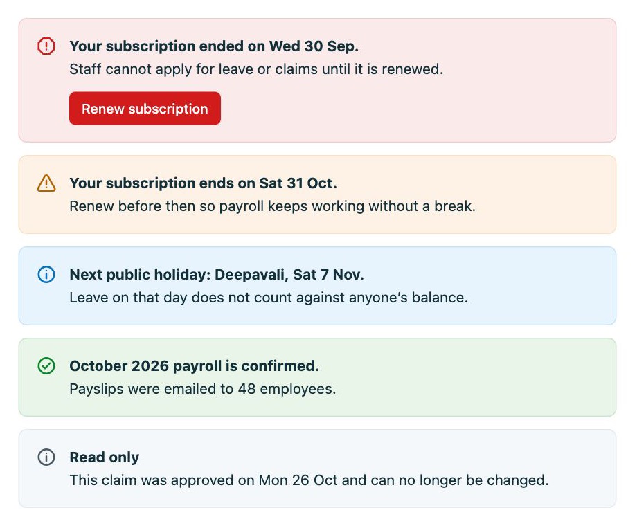
In HR software, colour carries meaning: red on a payroll screen makes people worry. So each colour does one thing, everywhere.
-
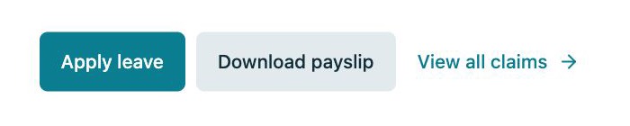
Teal means "do something"
Only action buttons and links. Selections use a light tint, never a solid fill.
-
Red means "needs you now"
Approvals waiting, or something that stopped working. Never decoration.
-
Orange means "heads-up"
Pending, low balance, a subscription ending soon.
-
Green means "done"
Approved, paid, sent.

Tokens
One pattern for every colour
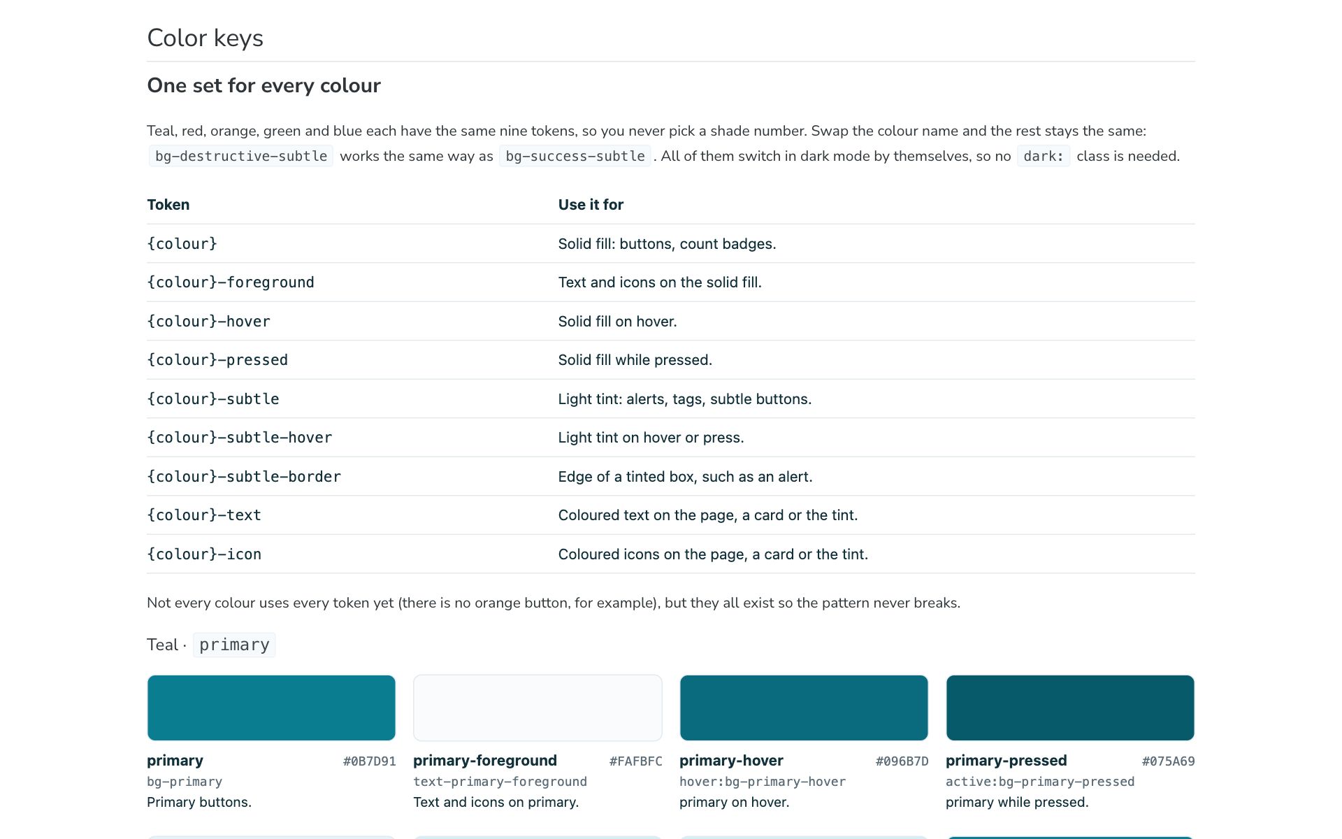
Teal, red, orange, green and blue each have the same nine tokens, from the solid fill to its hover, pressed and subtle tints. Engineers never pick a shade number; they swap the colour name and the rest stays the same.
Screens only use meaning-based tokens, so dark mode is already prepared: every token has a dark value, ready for when the product adds it.
Accessibility
The brand teal failed its own buttons
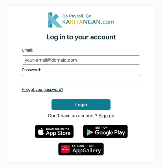
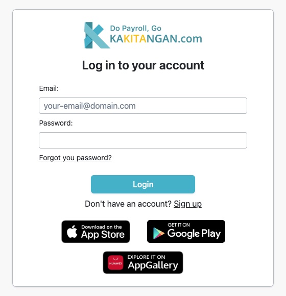
White text on the brand teal was hard to read. So the bright teal stays for the logo and illustrations, and a deeper teal is used wherever there's text.
- Before · #45B1C9
- 2.5:1
- Fails the 4.5:1 minimum
- After · #0B7D91
- 4.8:1
- Passes
- A visible focus ring on everything you can use by keyboard.
- Only urgent messages interrupt screen readers; the rest wait.
- Animations stop for people who turn off motion.
Built for HR and payroll
Rules a generic design system wouldn't have
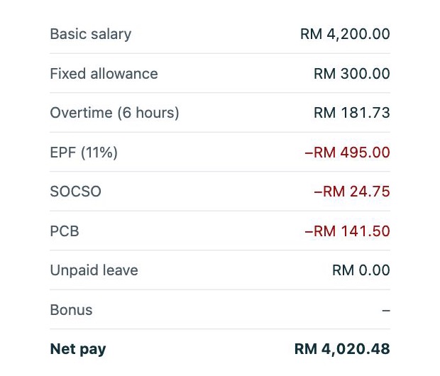
Money always reads the same
"RM 1,250.00": never shortened, always two decimals, digits that line up, and deductions with a real minus sign in red.
Alerts that match how serious things are
Five tones, each with a clear use. Only "something stopped working" interrupts a screen reader.
Writing
Words are part of the system
Many users aren't HR experts, so the system includes writing rules as well as visuals.
| Rule | Instead of | Write |
|---|---|---|
| Sentence case | Apply Leave | Apply leave |
| Buttons say what happens | Submit | Renew subscription |
| Counts say the thing | Leave: 3 | 3 people away today |
| Empty states reassure | No data | Everyone is in. No leave is booked for this period. |
From docs to code
A system engineers actually use
A design system only works if it's in the code. I restyled the engineers' shared components to match, fixed the accessibility gaps I found, and rewrote their Storybook pages so each one explains when to use it, not just how.
-
Buttons
Fewer kinds, clear names, icons on either side.
-
Select and inputs
Full keyboard use, screen reader names, errors linked to fields.
-
Tables
Numbers right-aligned, clear page-size labels, phone layouts.
-
Calendar
Readable "today", and weeks that start on Monday.
What I learned
- Rules about meaning ("red means needs you now") hold up better than rules about looks.
- A design system only counts once it's in the code, so the rules live in Storybook, right next to the components.
- Brand colours and readable colours aren't always the same, and that's fine if each has its own job.
What's next
- Move the remaining modules onto the deeper teal.
- Ship dark mode, since every token is ready for it.
- Add the logo files and illustration rules.
Next case study
Redesigning the Kakitangan.com website